Saturday 31 March 2012

Poster Layout Tests


I'm trying to get all the elements to sit together and create a more cohesive image. I decided to try outlining the elements inspired by the work of Alphonse Mucha. Above you can see various attempts at different pieces outlined. The top image works well with all the elements inside Bond's silhouette. I've always imagined this image with the tank and statue as a strong centre piece for the entire image. Adding an outline helps highlight this as an element where it would normal get lost in the blacks and greys behind. I also think the Xenia pose is really interesting and should be given space to sit at the front of the layout. You may have noticed I removed the satellite and helicopter. I don't think they're missed.

Friday 23 March 2012

Goldeneye Update

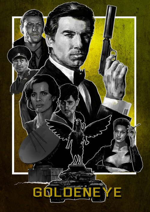
This piece is almost finished now. There's a lot more going on creating a more flow and movement around the image. I think I'm going to start on a new poster for another Bond film and then come back to this one later with some fresh eyes.

This has been one of the most exciting projects I've set myself recently so I want to crack on with more posters. I keep getting lots of ideas for different films and tv shows which could be made into great iconic posters. It's also good flexing my digital drawing muscles and seeing my work develop.

Thursday 15 March 2012

Goldeneye Poster Layout

I've made a some major additions to this piece now and it's moving fast towards a final poster. The main elements are all there now. Natalya (bottom right) and Orumuv (wearing the hat) could do with some touch ups on the clothes. I'm considering adding another character but when I think ahead to other posters in the series I might struggle to find 6 major characters to fill a poster. My other option would be to add more vehicles and possibly some scenery like the Severnaya radar dish. It feels like there is too much space going on and that I could be showing off more of the film. Working on this piece makes me wonder how Drew Struzan makes it look so easy?

Sunday 11 March 2012

Brosnan Finished

Finished up this portrait today. Having a few days off from it helped me find and alter the glaring errors. I'm happy that this resembles Mr Brosnan enough to move on. I want to use this piece as a base for my intended poster. I'll stick to black and white for now to keep the focus on composition and layout. I'm excited to get working and see how this all turns out. If it's successful I'd love to make this into a series of posters and maybe even extend into other films.

Monday 5 March 2012

Brosnan Bond Sketch

Spent a few hours working on this portrait of Pierce Brosnan's Bond. I hope this will be a focal part of the Goldeneye poster I have been working on over the past few months. As you can see, I still haven't quite caught Brosnan's face. I spent all the time this evening working and reworking areas trying to get everything in proportion. The chin was a particularly difficult area and was causing a lot of problems until I got that sitting right. The face may still be too long but I need to go away and look at this piece with fresh eyes tomorrow to see what else is throwing it off.

I do intend to colour this piece but I decided to work in black and white for now to help work out the proportions and shadow.

Sunday 4 March 2012

Eye Logo Touch Up

I spent some time today making some changes to this eye logo which I made a while back. Having fresh eyes on a piece really helps pick out flaws and problem areas in an image. The first major problem was the eye wasn't centred and was looking to the side. Above the image is much stronger having the eye look directly at the viewer. I also cleaned up the eye lashes making them larger and more defined. The eyebrow still looks weak in my opinion but overall I think I have improved.