Showing posts with label Poster Art. Show all posts

Sunday, 28 July 2013

Genesis of the Daleks poster work


I found some time to pick up a pencil and do some drawing this weekend. I've revisited this poster for Gensis of the Daleks. I'm still caught up in all the excitement for the upcoming Doctor Who 50th Anniversary this year. It would be great if I could produce a full series of posters covering some of my favorite episodes in time for the anniversary.

I had some inspiration for the poster layout when I was coming to end of my sketch work. I had a reference image of Davros' hand and realised it would be really menacing and creepy to have the hand enlarged looming over the poster. There's definitely some influence from 1950's science fiction posters coming through. It adds some great symbolism for Davros being the creator and controller of the Daleks. It also looks like he's moving the Dalek like a chess piece.

Davros still needs work as I just sketched in some of the areas late last night to give an idea of where I wanted to take it. I also have to include the Doctor. I may include the companions and I also have an idea for using the running soldiers along the bottom of the image to represent the war from the storyline.

Sunday, 10 March 2013

The Doctor's Wife Poster

I was only expecting to have another sketchy drawing to show today but instead of come up with this rather dramatic picture.The above image started as my drawing of Idris but then exploded into what you see above. Once I'd finished drawing Idris I started playing around with the glowing aura which started bringing the image to life. Suddenly I found myself adding more elements and experimenting with the background swirls, adding the tardis, darkening areas, and erasing elements until I found I had created something which could easily be used as a final image. A lot of the above was in my concept but I still have ideas to bring in other elements and I do want the Doctor's face included. Really pleased with how this came out.

Sunday, 11 November 2012

Girl In The Fireplace Poster

Here is my poster for my fave episode of Doctor Who, The Girl In The Fireplace. Spent a while today working on the portrait's of both the Doctor and Renette so they would match the quality of the android. I decided I would keep pushing to get this finished and add the other elements. I cheated a little bit with the fireplace. My original version just looked shit. I also realised I should make more of a feature of the clock  that sits on the fireplace. I created a new larger element for the cracked clock face which is also an important plot point in the episode. It makes for a great center piece as anything circular usually does. Once I had that positioned it was much easier for me to place everything else. The poster could still do with some tidying up. I'm not sure what to do with the bottom edge of the portraits. They look very rough in their current form. Maybe I'll stick a soft opacity gradient on it and be done with it. I'd love to add a title and find a nice font too but for now I just want to share the image as it is. Think I'll go watch an episode of Doctor Who now...

Tuesday, 17 April 2012

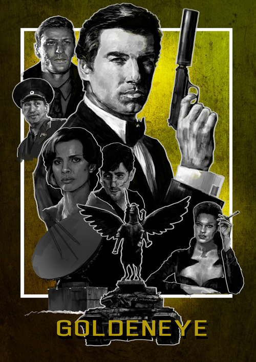
Goldeneye Black & White

I've spent the day doing lots of rendering and experimenting on some 3D stuff so I took a break from that this evening and spent an hour playing around with this poster again. I was looking at some 60's portrait photography earlier and it inspired me to take a different approach with this piece. I also had some great feedback which was to try removing some of the elements. I was also given the idea for the tagline which is just fantastic (thanks Andy!). I took it one step further and tried to see what was the bare minimum needed to sell the film. It was painful to lose some of the other portraits, I really enjoyed drawing them. I also tried the poster with just the tagline without the film title which I thought was great but it probably wouldn't appeal to most. This image excites me a lot more than my previous attempts. I love the classic look and I think it now looks like a poster that could actually be used to sell the film. There is no way the advertising people would have used something as minimal and arty as this for such a major movie but I think it's an enjoyable image. Trevelyan could probably do with some more work and detail. The poster relies a lot more on his likeness and presence than it did previously. So not quite finished, not sure I'll ever be completely satisfied!

Saturday, 31 March 2012

Poster Layout Tests


I'm trying to get all the elements to sit together and create a more cohesive image. I decided to try outlining the elements inspired by the work of Alphonse Mucha. Above you can see various attempts at different pieces outlined. The top image works well with all the elements inside Bond's silhouette. I've always imagined this image with the tank and statue as a strong centre piece for the entire image. Adding an outline helps highlight this as an element where it would normal get lost in the blacks and greys behind. I also think the Xenia pose is really interesting and should be given space to sit at the front of the layout. You may have noticed I removed the satellite and helicopter. I don't think they're missed.

Friday, 23 March 2012

Goldeneye Update

This piece is almost finished now. There's a lot more going on creating a more flow and movement around the image. I think I'm going to start on a new poster for another Bond film and then come back to this one later with some fresh eyes.

This has been one of the most exciting projects I've set myself recently so I want to crack on with more posters. I keep getting lots of ideas for different films and tv shows which could be made into great iconic posters. It's also good flexing my digital drawing muscles and seeing my work develop.